Research: User, and user interface - Jemima Monteiro
Resesrch on user and user interface
By Jemima
- A user interface must have a specific tab, usually titled as support, to make it easy for customers to attain help. Similar to the ones used in popular brands today like Apple, OPPO etc.
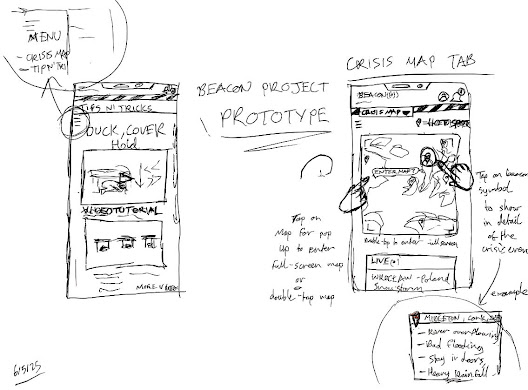
- A successful interface must include a table of contents which links to each specific section e.g. Interactive crisis map, Find help near me etc. and takes you there instantly, this means BEACON should have specific links for specific disasters so users can quickly access them in times of crisis.
- A key feature is to make sure that an option to download a pdf file of the instructions for each disaster is provided. This is to ensure safety measures are available to people who may not have internet access at all times.
- It is common practice to use highlighted words and icons in the user interface for dangerous disasters so it is easier to spot for customers who need information quickly.
- Emergency service contacts should be clearly visible at the top of the screen for people to contact help immediately.
- Each disaster should have a set of survival instructions and prevention measurements so people can avoid any incoming danger.
For the app
- We want the tabs to be easily accessible to the users and for them to be able to click on them with ease.
- First aid training should be clearly highlighted so it can be used if needed and have certain terms also highlighted along with their meaning so it's easier to understand.
- Like mentioned above we would also like to have some highlighted features which makes ut clearer for the user to read and understand.
- Have clesr and easy to download pdf instructions for first aid.

.png)
Comments
Post a Comment